
Incentivizing players to invest in hero collections
I led the UX/UI design for Hall of Heroes, a collection-based progression feature that transforms hero advancement into long-term goals. I designed interfaces that help players track collection progress, understand reward milestones, and identify opportunities to strengthen their hero collections.

My role
My Team
Platform

Context
CONTEXT
Business Objectives
Increase the overall value perception of the hero progression system.
Encourage players to collect and upgrade a wider variety of heroes.
Create clear progression goals tied to themed hero collections.
Drive engagement with existing hero-related systems, including relic acquisition, summoning, and progression events.
Improve monetization and long-term investment in the hero economy.
CONTEXT
Constraints and Limitations
New button to access the Hall of Heroes at the bottom of the main screen in the Tower of Hand
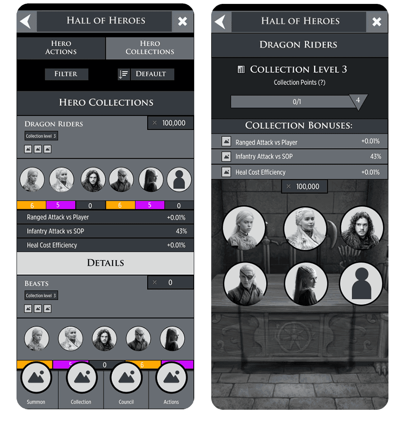
New panel to show the Hallo of Heroes with all the collections where the players can scroll through to view each collection available.
Collection Panels will:
Have a drop down arrow button that shows each collection details
Display the collection theme name
Icons showing the reward buffs offered
Player will be able to see their collection level
Attack power icon of buffs earned in the collection
See how many stars they’ve unlocked
Collection Details will: Display more information about what progress that player has made, and what specific heroes are in the collection.
Show the full hero cards. Cards must be tappable and bring the player to the card details
The collection level
The collection points acquired in a progress bar
The chart button which will bring the player to another page and it outlines all the stats they’ll get
Design Process
🔍 Research
The research phase focused on understanding the end-to-end player experience and defining how a hero collection system could support the product goals. Working with product, game design, engineering, and art stakeholders, I participated in high-level user journey mapping, low-fidelity wireframe exploration, and cross-functional discovery sessions. This helped identify player goals, feature requirements, and align the team on the overall vision.
DESIGN
Competitor Analysis
I conducted a competitive analysis of collection-based progression systems in games such as Star Trek Timelines to understand how they motivate long-term character investment and collection completion. These products demonstrated effective use of themed collections, roster-wide progression, and passive rewards that encourage players to engage with a broader set of characters rather than focusing solely on a small core team.

DESIGN
Flowchart
Ultimately, stakeholders wanted to create a new feature without reinventing the wheel. That was one of my constraints. I took visual inspiration from the armory section in the game as well as from Star Trek. I kept that in the back of my mind, while I worked on the UX. Firstly, I created a flow chart to figure out how to guide the user through this feature. In the tower Hand, it was logical to add a second tab in the Hero collection section. This was a good spot for the Hall of Heroes to live due to relevancy and proximity.

After creating the flow chart, I began creating low-fidelity wireframes. After showing the team and stakeholders, there were discussions more about visuals and less about the flow. I provided two options for the Hall of Heroes. Option A displayed the rarity of the heroes and stats, while option B showed a progress bar and had a drop down approach that displayed more information such as stats, and heroes. The team liked option A more, but suggested a few tweaks. Option A is closest to what we have in game within our armory. Although option B provided a fresh look, I thought familiarity paired with a new concept is a better way to go.
Option A | Option B |
|---|---|
 |  |
DESIGN
Feedback
The stakeholders were engineers, a community manager, a producer, and game designer. The few tweaks were to display the hero rarity in a different way, add a favorite button, and a details button.

DESIGN
Best of Both Worlds
There was a lot of discussion and reiteration but overall, Option C was a combination of option A and B. The team and stakeholders liked this and we collectively decided to go with the option that shows everything the players needed upfront as opposed to having them “dig” for it. My motto is “The less taps the player has to make, the better. If the player has to tap more then let it be worth it.” The rule of thumb is to think for the player. Option A had too much information,which can be overwhelming, while option B lacked information front-facing. Option C is the perfect combination that shows just enough information. The progress bar was the most important element I thought needed to be shown, so players would immediately know the amount of progress they’ve made on a collection.
Option C

THE FINAL OPTION.
Outcome
✨ Learnings
I’ve enjoyed this project so much. There’s nothing I love more than creating something from scratch and shipping it off to the world. I expect for there to be problems, but the entire point of UX is to minimize that as much as possible, but also realize you cannot “fool-proof” everything. As a team we agreed to make a V2 of this feature because we want to expand on this by adding milestones and an additional stat.
🔮 Future Thinking
I learned more about auto layouts in Figma and how important they are. Not only that, but I contributed more to the design library. Design libraries are significant because they made your process more efficient. This project also reinforced the greatness that is collaboration. I enjoy brainstorming with peers because everyone has something to contribute and is valuable. We think of many ways to accomplish one thing and it’s great because I never want to shut out an idea. Being open minded while designing brings out the best designs.
BEFORE · WIREFRAME

AFTER · SHIPPED EXPERIENCE

BEFORE AND AFTER.